
Stories
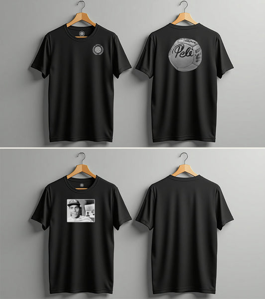
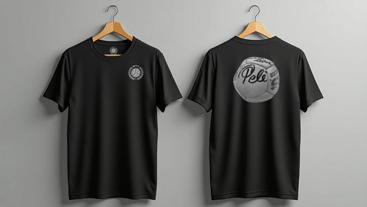
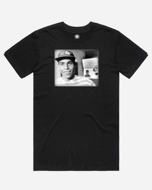
Two shirts. Two legends. One reason we started ...
The With Love, Pelé and Ronaldo: The Moment tees aren’t just graphics — they’re markers of the moments that shaped the game, and us.
Two shirts. Two legends. One reason we started ...
The With Love, Pelé and Ronaldo: The Moment tees aren’t just graphics — they’re markers of the moments that shaped the game, and us.
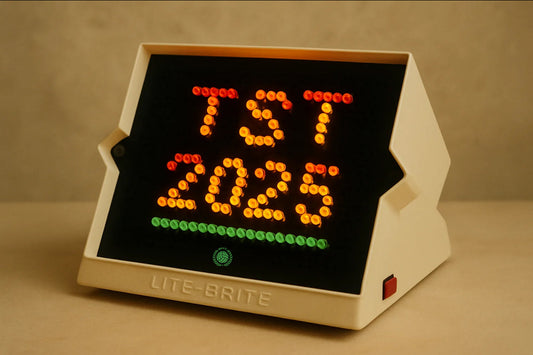
TST 2025 Groups Announced
TST has announced the groups for the 2025 tournament and with that, the Bumpy Pitch men's and women's teams know who we will be playing. Let's start with the women's...
TST 2025 Groups Announced
TST has announced the groups for the 2025 tournament and with that, the Bumpy Pitch men's and women's teams know who we will be playing. Let's start with the women's...
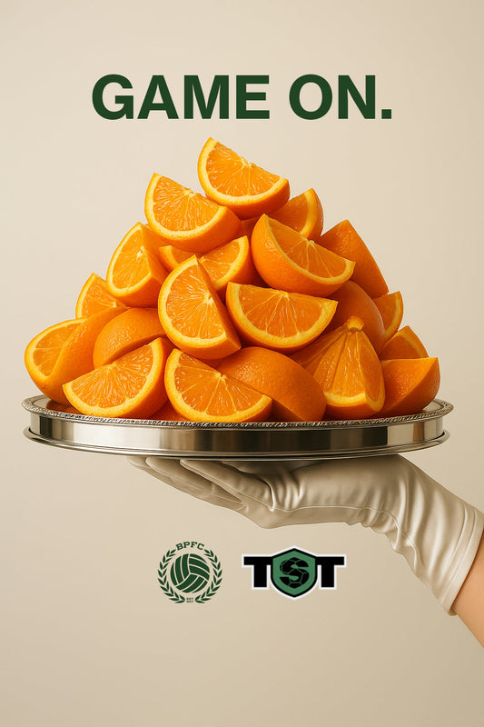
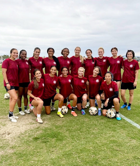
Bumpy Pitch Making TST Debut in 2025
Bumpy Pitch FC is making our debut with a men’s and women’s team this June in the TST tournament
Bumpy Pitch Making TST Debut in 2025
Bumpy Pitch FC is making our debut with a men’s and women’s team this June in the TST tournament